300 Years Before Color, Velvet Royal Blue Edition. NEW.
The Artwork That Was Created 300 Years Before Pantone.
Over 900 pages written and painted entirely by hand.
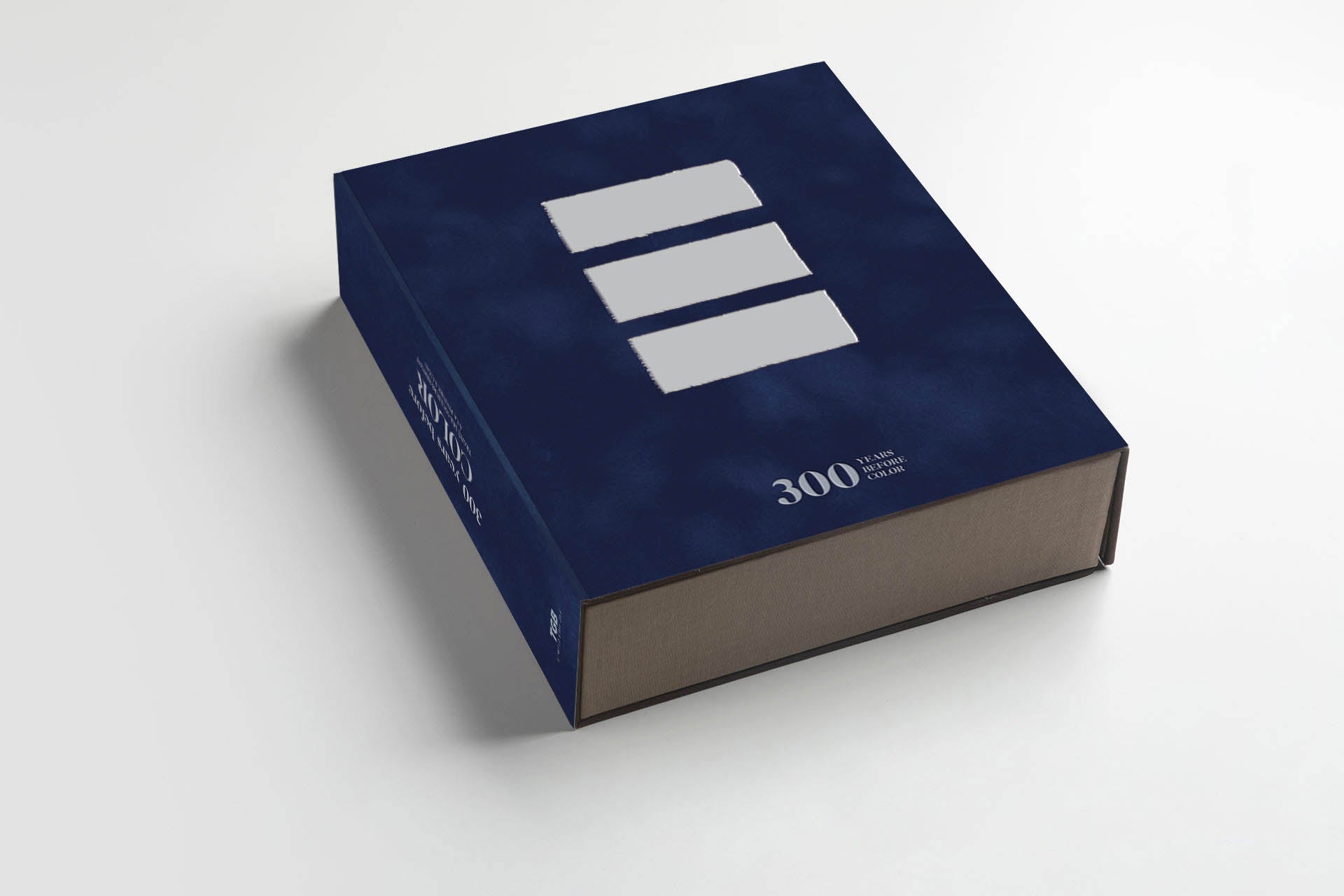
300 YEARS BEFORE COLOR, Velvet Royal Blue Edition.
300 YEARS BEFORE COLOR, Velvet Royal Blue Edition.
Complimentary shipping
No se pudo cargar la disponibilidad de retiro
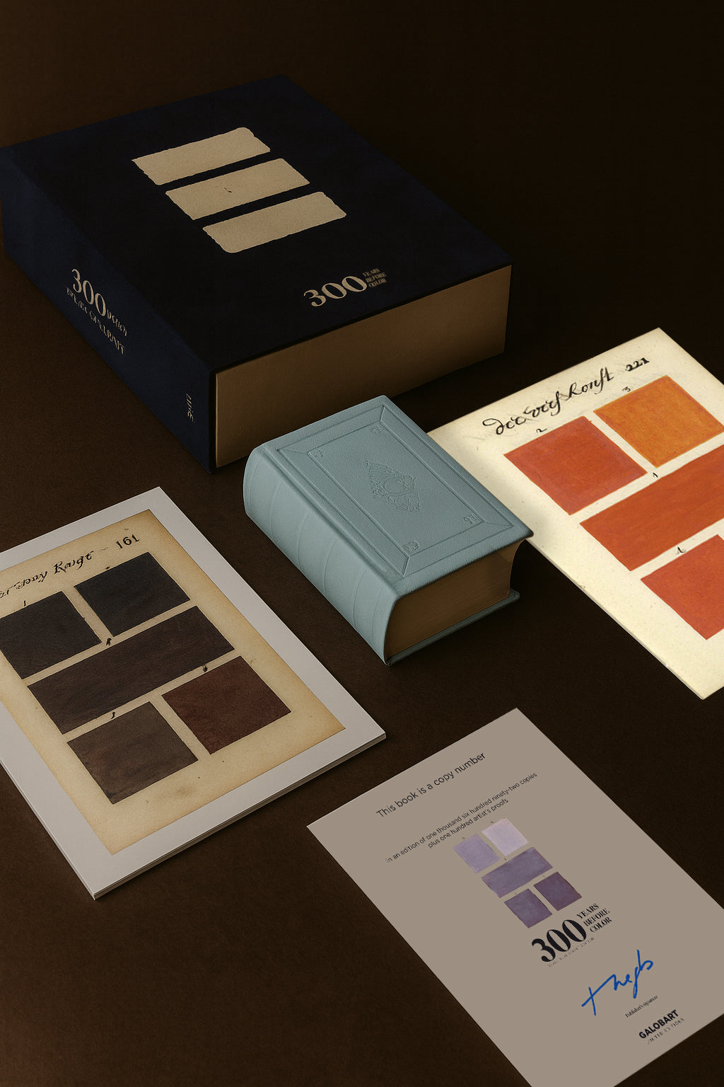
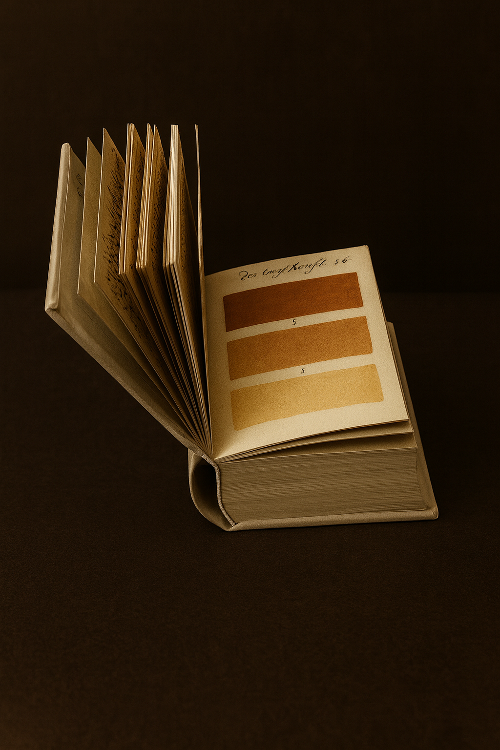



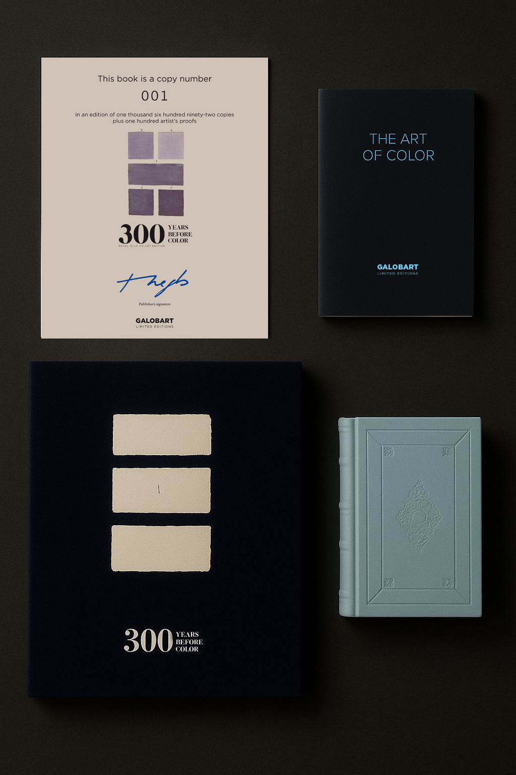
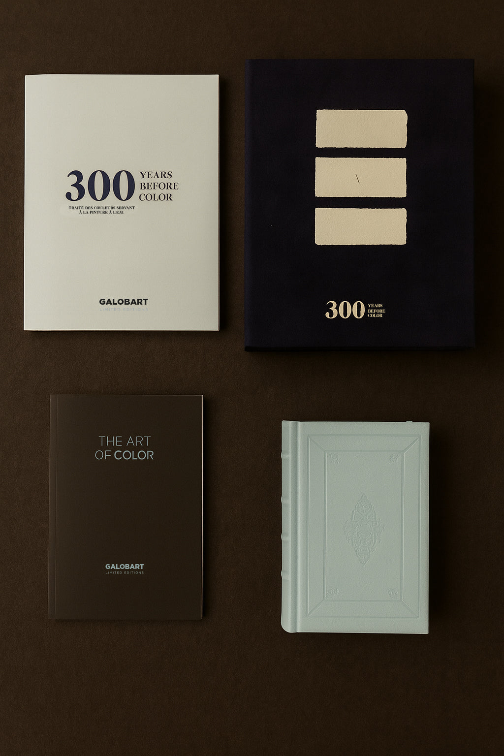
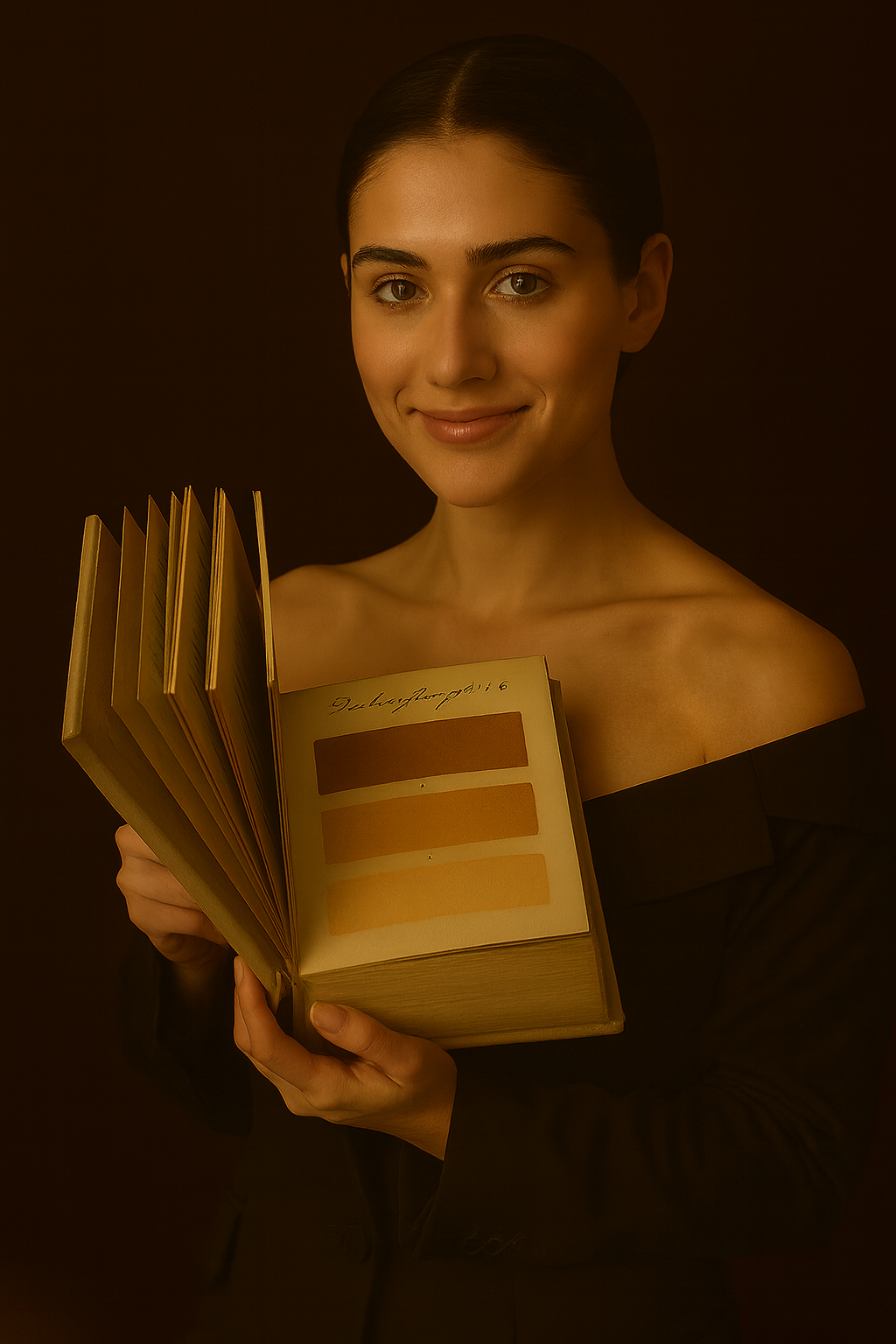
300 YEARS BEFORE PANTONE, AN ARTIST MIXED AND DESCRIBED EVERY COLOR IMAGINABLE IN A 912-PAGE BOOK. OUR BEST SELLER.
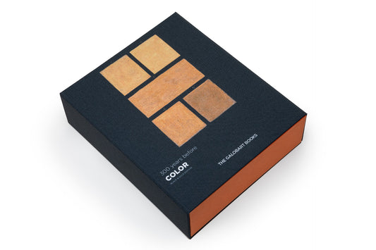
NEW ROYAL BLUE AND SILVER VELVET LIMITED EDITION
1,692 copies, numbered and signed.
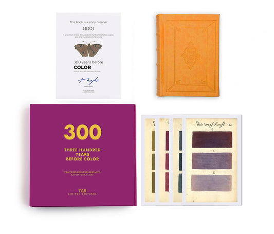
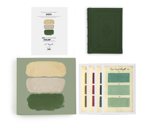
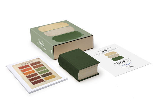
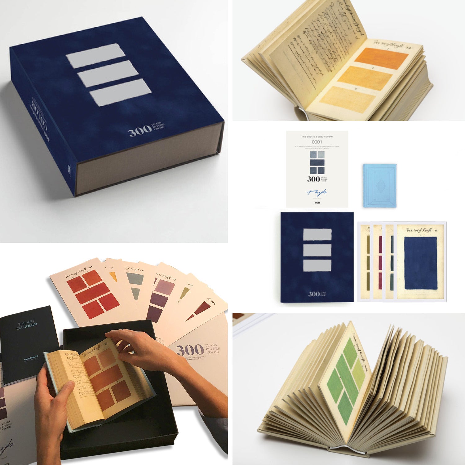
Facsimile book that reproduces the original. Hand bound. Printed on Fedrigoni Luxury Paper.
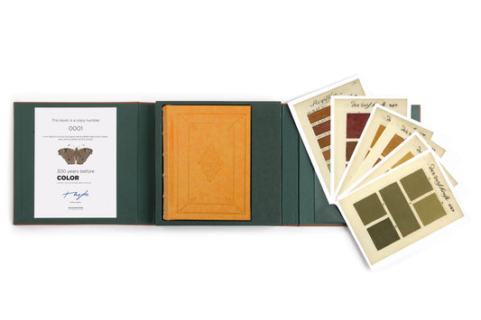
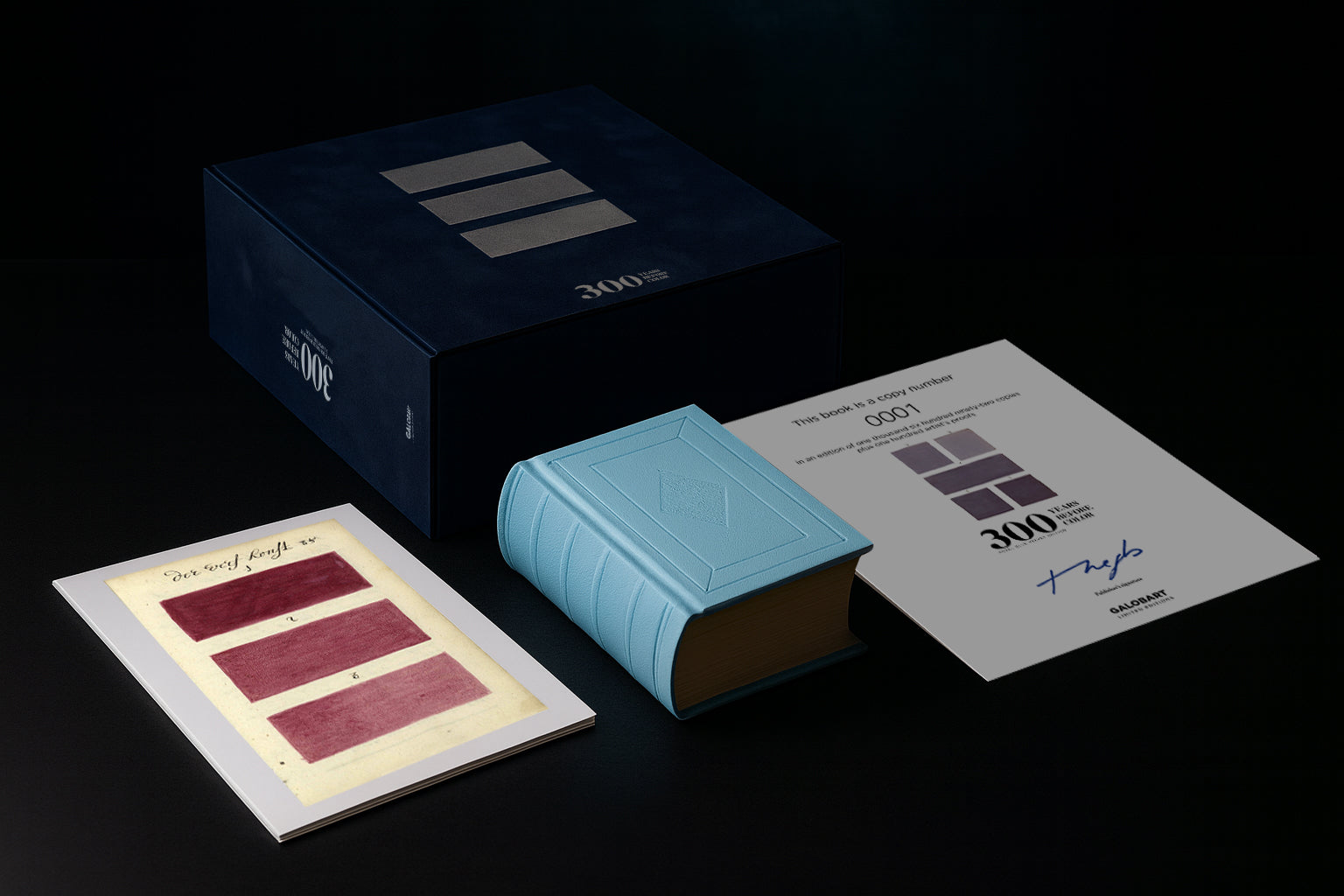
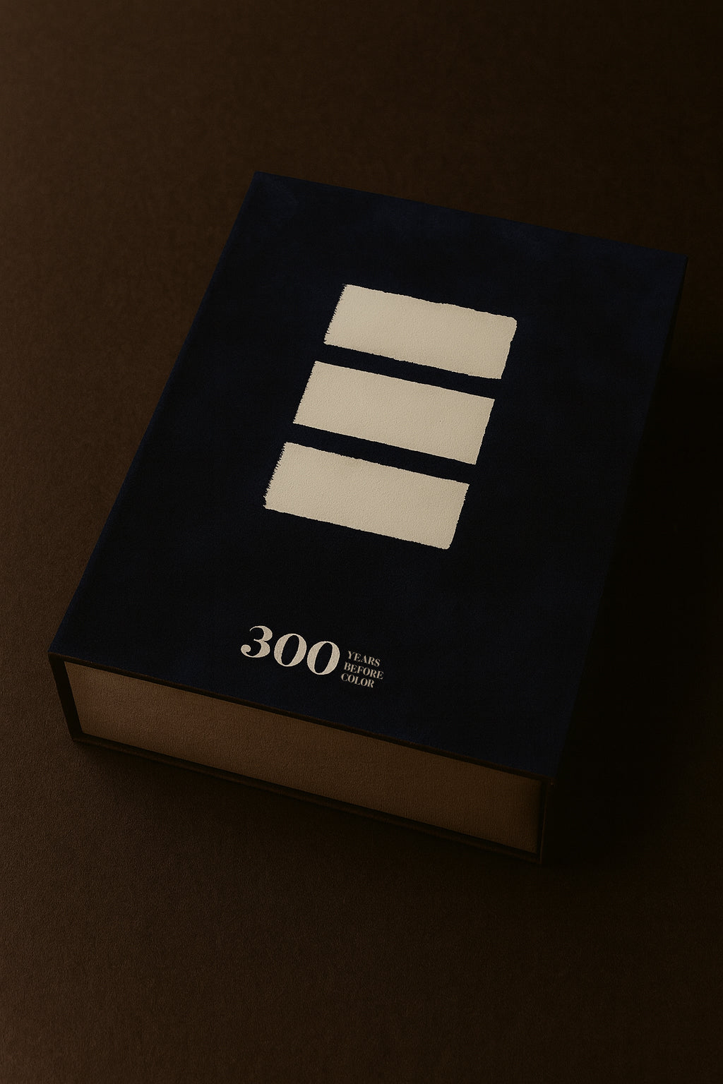
An elegant royal blue velvet case, hand dry stamped in matte silver. Each case is different and unique.
Also includes 10 new limited edition art prints to collect or frame.
Numbered certificate of the edition.
And a book with texts in English by renowned artists from the art world, museum directors, graphic designers, advertising creatives...
*NOW $159/ After $280
*Last Copies:
September 19th: $195
September 26th: sold out online. (Only few books in specialized bookstores – $280)
Free shipping now. Receive it in a few days. See our customer reviews.


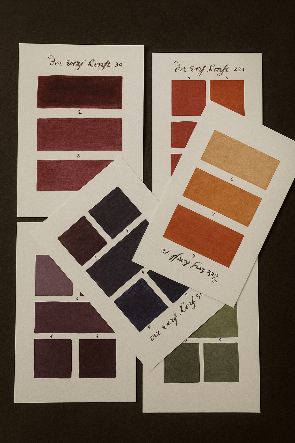


OUR BEST SELLER. NEW LIMITED AND NUMBERED FACSIMILE EDITION OF 1,692 COPIES:
It was 1960 when Lawrence Herbert was working in a color printing and sales company mainly focused on cosmetics. This businessman and great visionary chose to take over the assets of a company that was $50,000 in debt.
In 1962 Herbert founded Pantone, creating a new formula from 10 pigments in order to obtain more uniform results and resulting in a guide of 500 colors. The success was immediate in companies dedicated to the graphic arts, industrial and textile industries; a great example of its usefulness was the Kodak brand, which during the 50’s began to suffer great losses in the sale of its photo reels because in its boxes the yellow color did not always share its homogeneity, causing people to reject the packages with a darker shade that led them to think that it was not the original of the brand or that perhaps it had expired.
These well-known and widely used color guides in the world of design are a “must” that has also managed to sneak into the creative universe by varying and playing with more and more surprising models.
But 300 years before the Pantone… what many do not know is that the first guide similar to Pantone was created by a Dutch artist. A. Boogert wrote in the year 1692 a detailed work in which he presented colors and their scales in watercolor, discovering their nuances to the world by mixing them with each other. Over 900 pages written and painted entirely by hand.
Only one copy of this sensational and advanced volume exists in the Bibliothèque Méjanes in Aix-en-Provence, France. This is because in 1692 the printing press did not yet have the technology to print such a treatise. It would be another hundred years before it could be reproduced with any reliability, through lithography.
⭑⭑⭑⭑⭑
Alejandra! Il pacco è arrivato!
Il libro è bellissimo, la confezione superlativa!
Thanks to you, Susanna
Susanna di Martino
Rome, Italy.
⭑⭑⭑⭑⭑
Hello again,
Just a quick note to let you know that I have now unpacked my order & am delighted with the book.
It’s really beautiful & so interesting.
Thanks for a great item!!
Regards
Lesley Kohler,
London, United Kigdom
⭑⭑⭑⭑⭑
Hello Alejandra,
I wanted to send a note of thanks to you and The Galobart Books team for exceeding expectations in the fulfillment of my order of the 300 Years of Color - Rothko Edition.
With limited optimism in receiving the book before Christmas, I placed my order at the 11th hour and was delighted that it delivered 24-December!
Thank you for your efforts! I will look forward to my next opportunity to do business with The Galobart, and will certainly recommend you to my family and friends.
Mark B.
New Jersey, United States of America.
⭑⭑⭑⭑⭑
Your facsimile of de Boogert’s work is a wonderful addition to my bookshelf, and will be invaluable in my explorations of the way artists perceive and use colour.
Jane Jelley
Oxford, United Kingdom.
Author, Traces of Vermeer
⭑⭑⭑⭑⭑
My wife absolutely loves it and will use it as a source of inspiration for her future art works.
If you ever plan on publishing a similar little gem, please do not hesitate to contact us. We’d be very interested.
Cor Schreurs
Elizabethtown, Canada.

Customer Reviews
-
Emily Bowen | ⭑⭑⭑⭑⭑
My wife absolutely loves it and will use it as a source of inspiration for her future art works.
-
Regina McCormick & Tyler Mann | ⭑⭑⭑⭑⭑
We have received our copy. I just wanted to say it's very beautiful and we are really enjoying it. My husband and I are designers and artists.
-
Frank Santoro | ⭑⭑⭑⭑⭑
As someone who’s works in color in real life and online—this facsimile reproduction of the 1692 “Bible of Color” is somehow life-affirming.
-
Larry Stewart | ⭑⭑⭑⭑⭑
Hi, Alejandra! I received my "300 Years Before Colour" last week, and I am absolutely delighted in every way with it! Thank you all so much!
NEW FACSIMILE EDITION
This 912-page book is a new facsimile edition of the original “Traité des couleurs servant a la peinture a l’eau” by A. Boogert; a numbered, limited, worldwide edition of 1,692 copies, in homage to the year in which Boogert wrote the book.
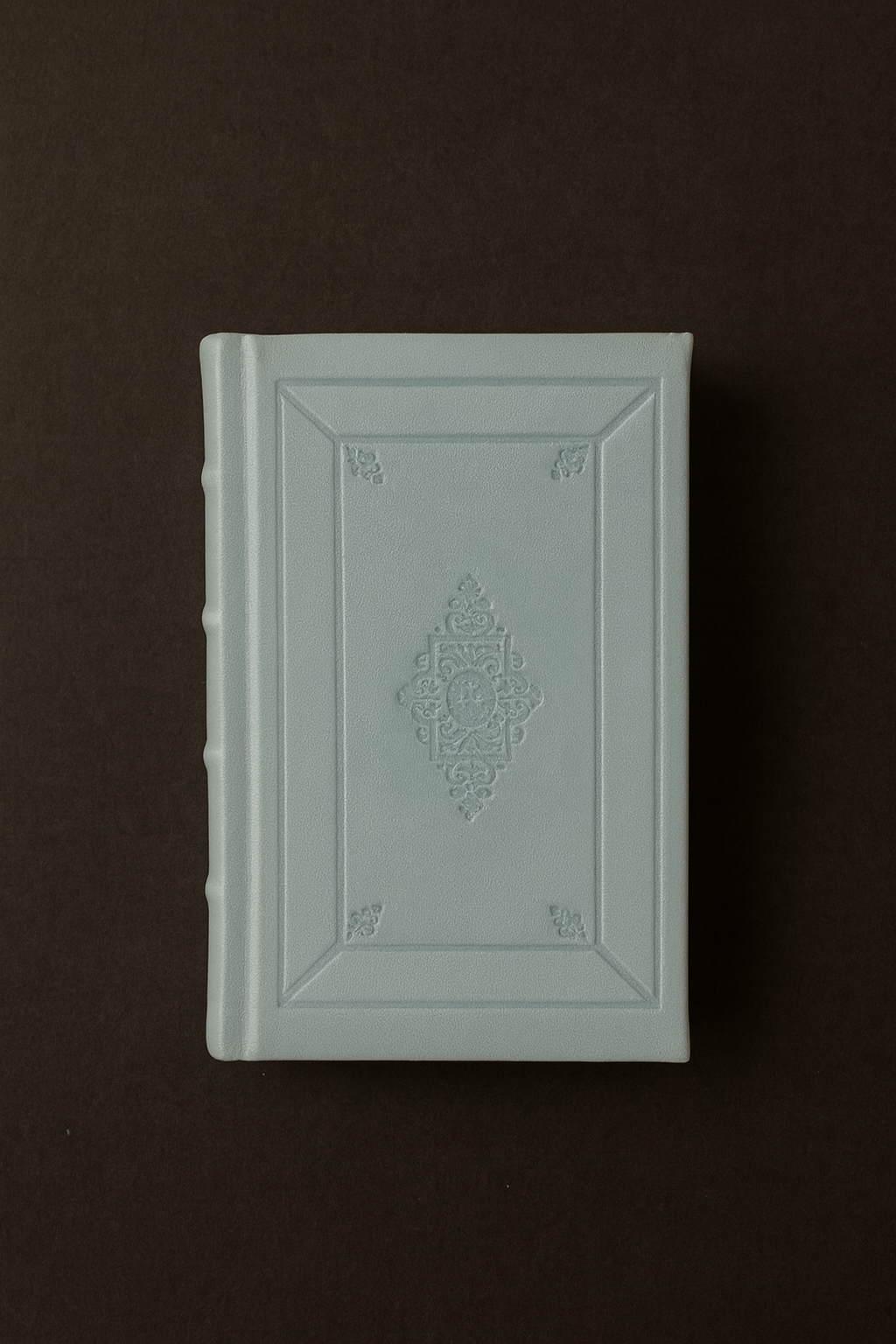
In this new facsimile edition: hand-bound, the hard cover made in light blue Vivella f147, reproduces the design of the original dry-stamped cover with four ribs on the spine.
The interior is printed in Fedrigoni Arena Rough Natural, a luxurious paper with a slight bone tone that imitates and reproduces the papers of the period.
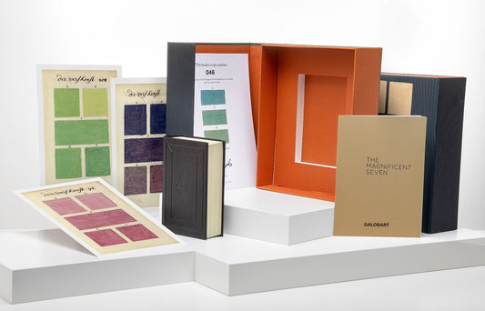
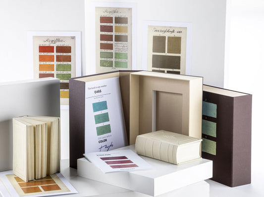
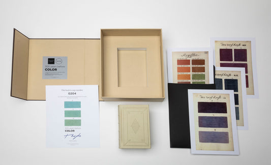
An elegant case in blue velvet, matte silver dry stamped. The slipcase includes, in addition to the original book, a numbered and stamped certificate of originality and ten magnificent art prints also in limited edition printed on 300 gram NEW PIONNER paper for framing or simply collecting them.
The book reproduces the original text in the author’s native language, where in the more than 900 pages of the book, the artist provides the proportions of pigment and water necessary to create each color with its tones and shades. To illustrate his explanations, he draws each page with the colors he is talking about. In addition to an index in which all the colors are listed and ordered, Boogert states in the introductory text that the book was created for educational purposes.
Over 900 pages written and painted entirely by hand, “Le Traité des couleurs servant à la peinture à l’eau” was the most complete guide to painting and color of its time.
The result was a splendid didactic guide. But the irony is that only a single copy existed, which was probably seen by very few people. If not, it would have served as an indispensable tool for more than one artist for centuries to come.
The book is accompanied by a booklet: The Color Artists with texts by prestigious art curators, writers, museum directors, artists, publishers… on some of the most important painters in history in terms of the use of color: Vermeer, Rothko, Basquiat, Sorolla ….
An ode to color, to Pantone: the essential color guide in the universe of creativity and design whose use has transcended centuries to remain a fundamental tool in the contemporary era.
⭑⭑⭑⭑⭑
Hi Alejandra,
Love , love it, love it…
Thanks for the color book, a beauty.
Jane Zuidema
Utrecht, Netherlands.
⭑⭑⭑⭑⭑
When the ad popped up in Instagram for this piece, I showed my husband right away – we both knew we had to have it.
Regina McCormick & Tyler Mann
Stafford, VA, United States of America.





What's Included
VELVET CASE
An elegant Royal Blue Velvet case, dry-stamped in matte silver, containing the original facsimile book, 10 art prints and numbered certificate of originality.
CERTIFICATE OF ORIGINALITY
Certificate of originality, numbered from 1 to 1,692, printed on NEW PIONNER paper of 350 grams.
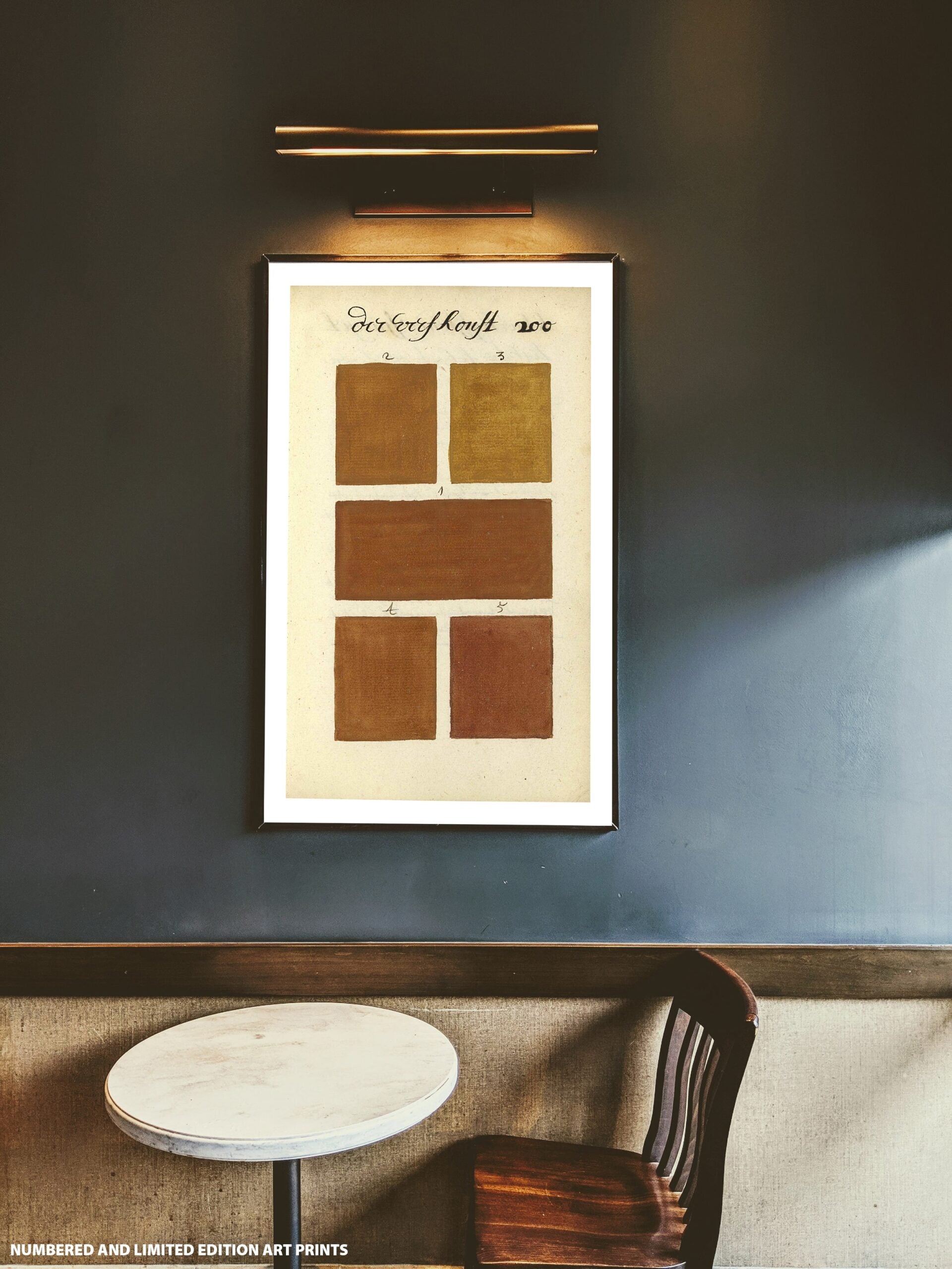
COLLECTION OF LIMITED EDITION PRINTS
Ten new prints for each collector’s edition, selected and limited to 1,692 units, printed on 300 gram NEW PIONNER paper, for framing or simply collecting..
STUDY BOOK
A booklet, The Color Artist, in which renowned artists from the art world, artists, museum directors, art curators, specialists in Dutch painting, writers …offer us their perspective on seven of the most important painters in history in terms of the use of color: Vermeer, Rothko, Basquiat, Sorolla…..
In contrast, an article on the grisaille (grisaille) technique, “no color”, used by artists since the Middle Ages and during the Modern Age, makes use of gray tones and incorporates a sense of monumentality and a unique sculptural dimension to painting.
In English and Spanish.

CONTACT US FOR ANY QUESTIONS YOU MAY HAVE
Others also love...
-
300 YEARS BEFORE COLOR, Velvet Royal Blue Edition.
Precio habitual $159.00Precio habitualPrecio unitario / por -
300 YEARS BEFORE COLOR Deluxe Edition
Precio habitual $280.00Precio habitualPrecio unitario / por -
300 YEARS BEFORE COLOR Rothko Tribute Edition
Precio habitual $280.00Precio habitualPrecio unitario / por -
300 YEARS BEFORE COLOR Black & Gold Edition
Precio habitual $350.00Precio habitualPrecio unitario / por -
300 YEARS BEFORE COLOR Brown & Ivory edition
Precio habitual $350.00Precio habitualPrecio unitario / por -
The Birds of America
Precio habitual $170.00Precio habitualPrecio unitario / por -
Codex Madrid I and II (Leather Edition)
Precio habitual $480.00Precio habitualPrecio unitario / por -
Codex Trivulzianus
Precio habitual $250.00Precio habitualPrecio unitario / por

