FREQUENTLY ASKED QUESTIONS ABOUT 300 YEARS BEFORE COLOR
Was this the first color guide in history?
Many historians consider the manuscript created by A. Boogert in 1692 to be one of the earliest systematic color guides ever produced.
More than three centuries before modern color systems such as Pantone, Boogert carefully documented how pigments could be mixed with water to produce precise tones and variations. His work represents one of the first known attempts to organize color mixtures in a structured and visual way.
Was this the first Pantone-like color guide?
In many ways, yes. Although the Pantone color system was introduced in the 20th century, the manuscript by A. Boogert already organized and documented color mixtures systematically as early as 1692.
By presenting colors in carefully controlled gradients and mixtures, the manuscript functioned as an early visual reference system for artists — a concept remarkably similar to modern color guides used by designers today.
How many colors are documented in the manuscript?
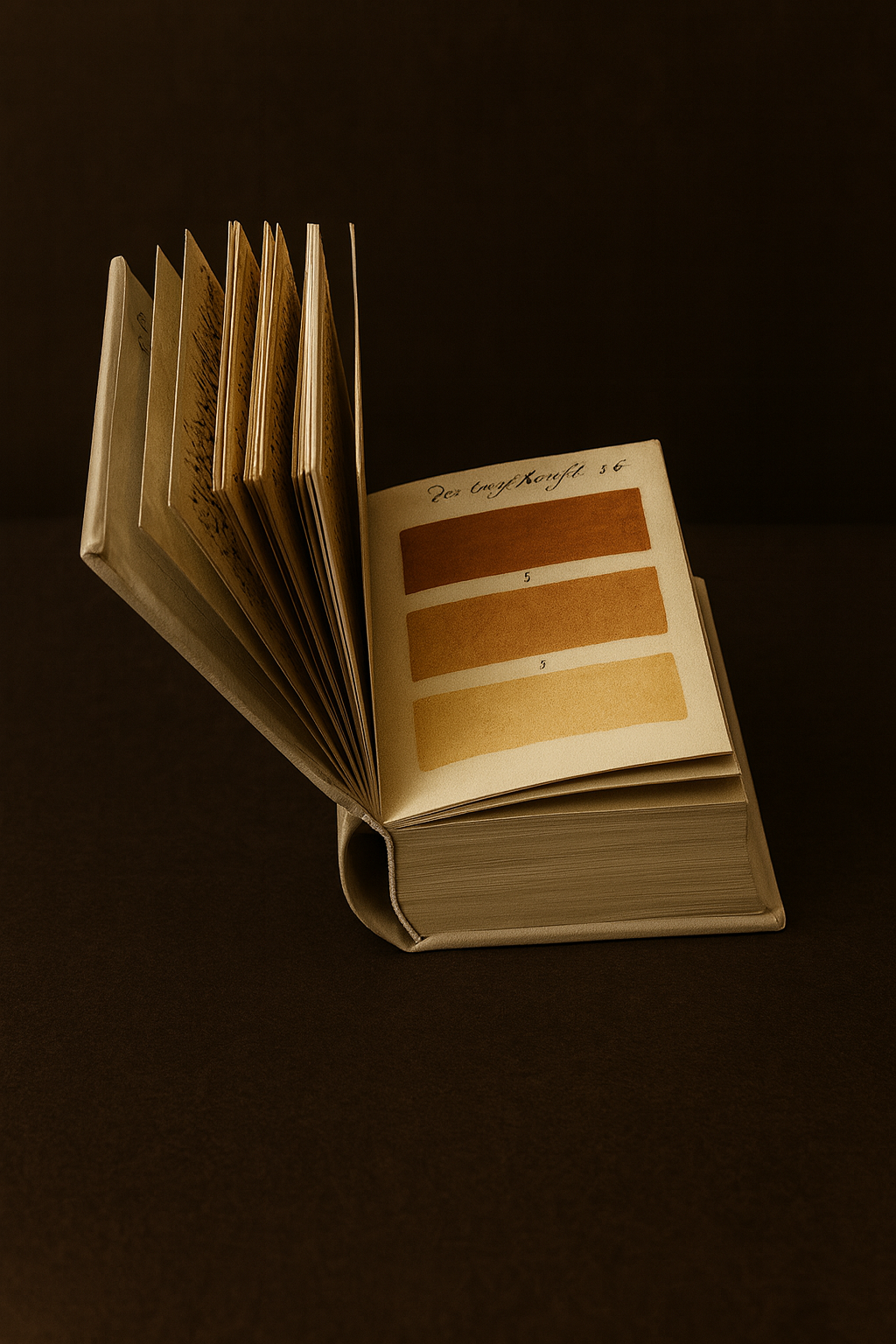
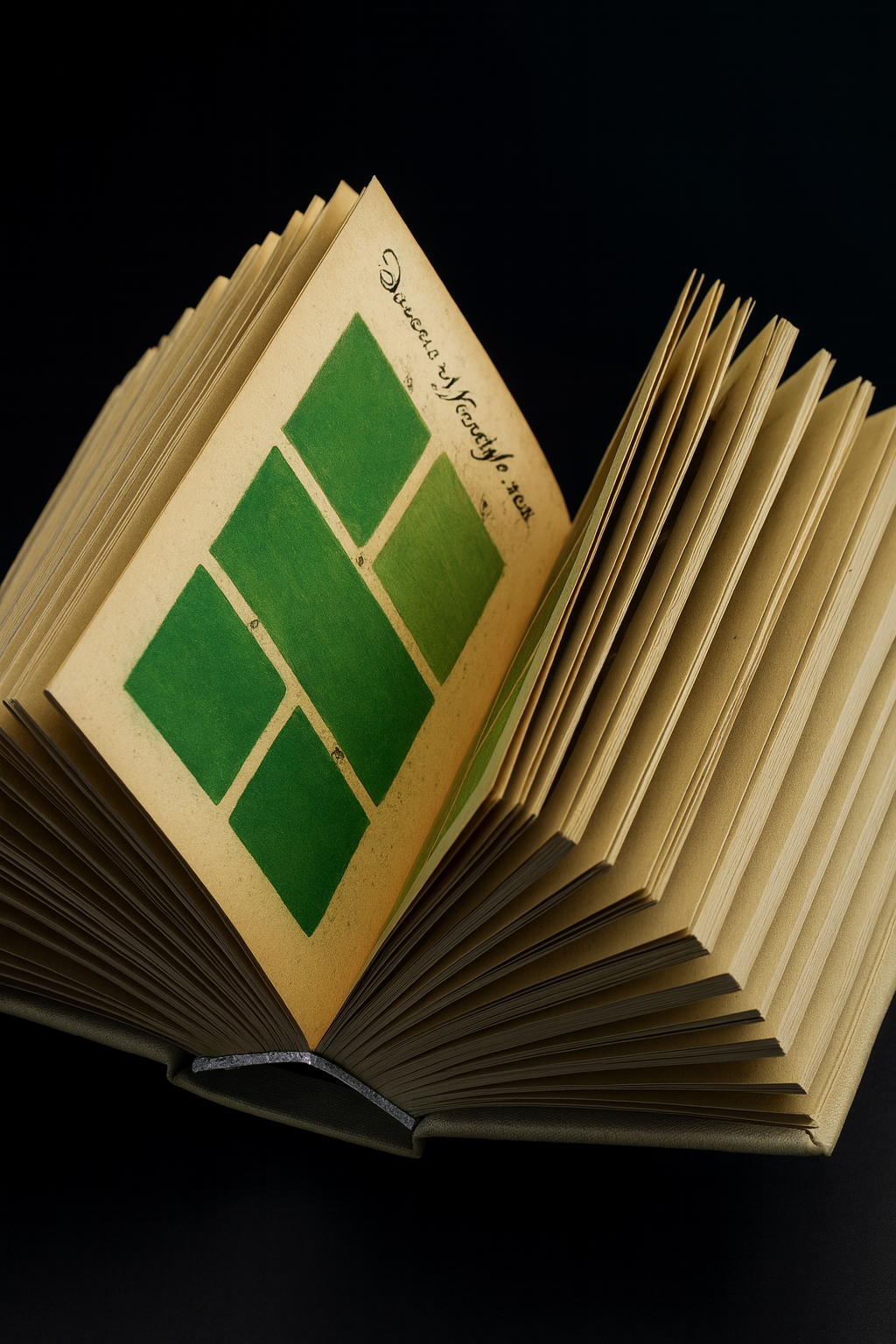
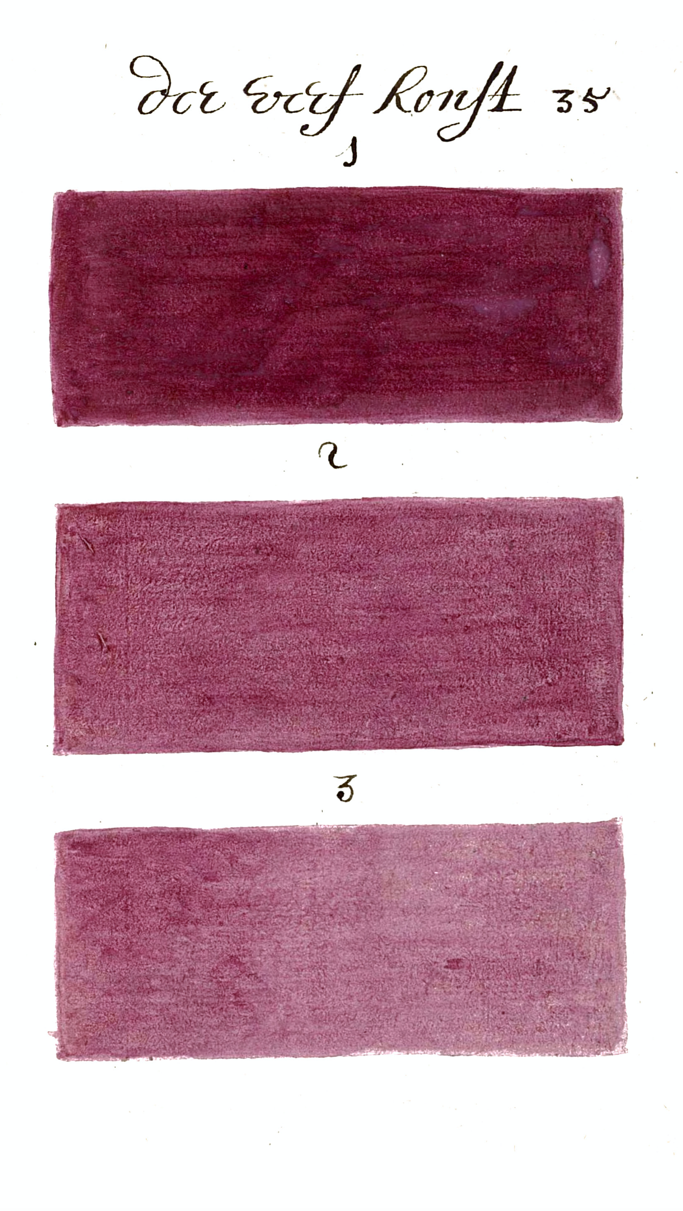
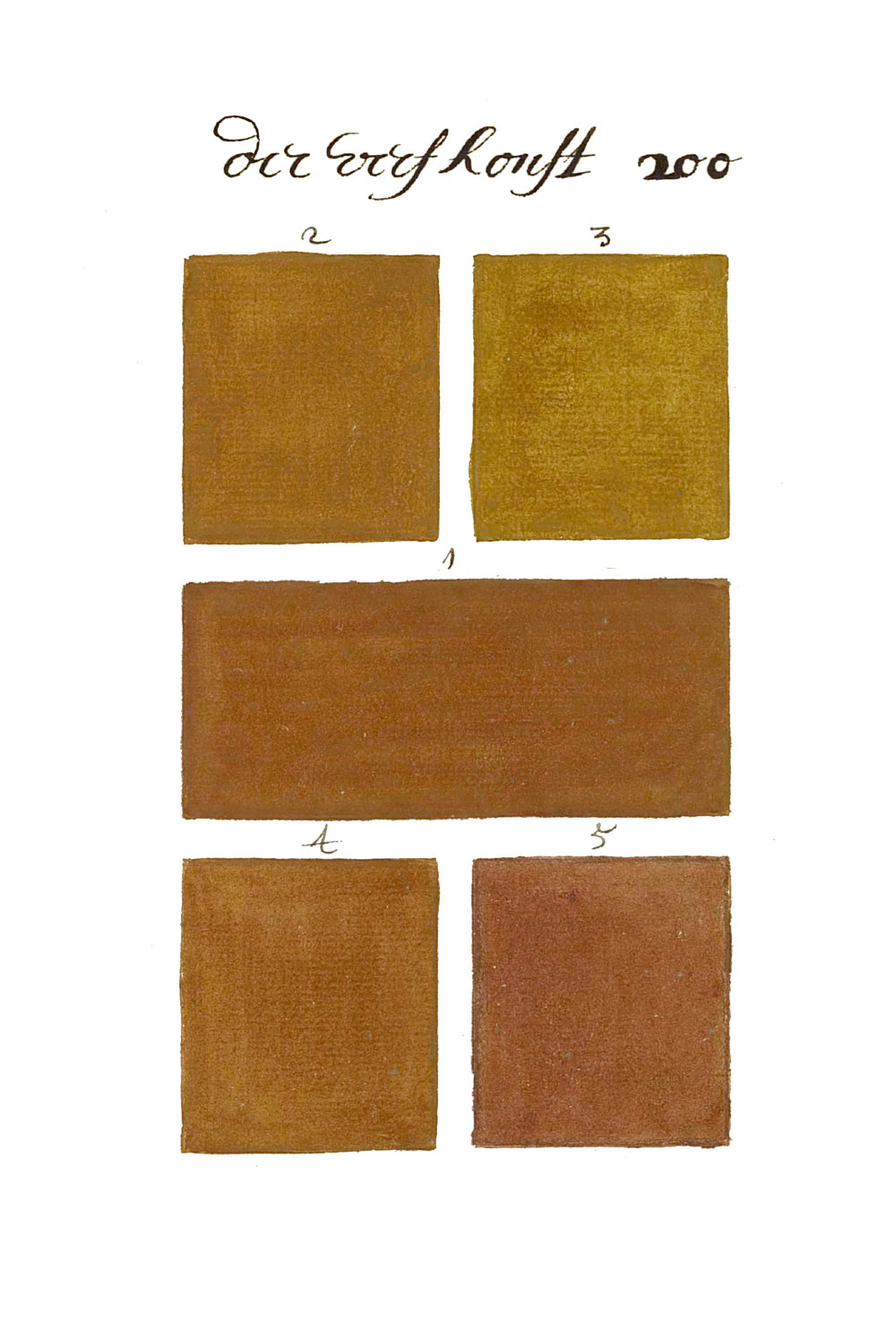
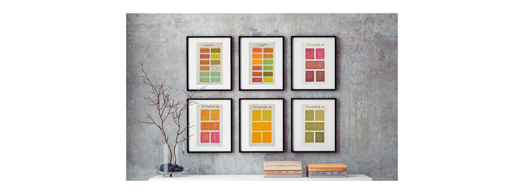
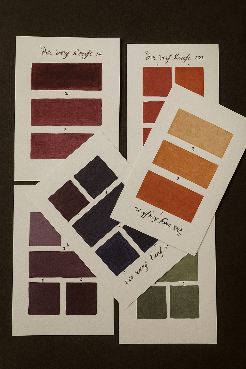
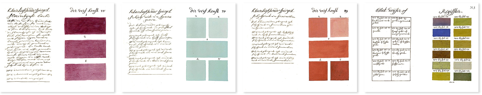
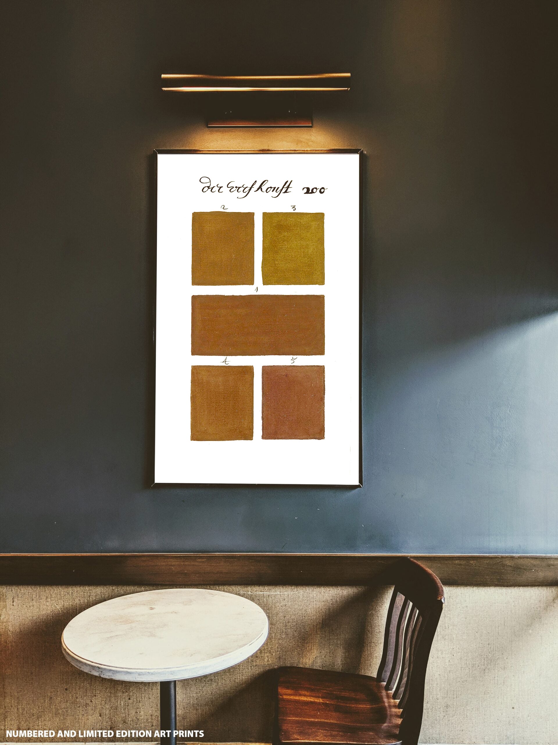
The manuscript contains more than 900 pages painted entirely by hand, each page presenting between three and seven individual color samples.
In total, the work documents nearly 5,000 different color variations, created by mixing pigments in precise proportions and diluting them with water to produce subtle tonal shifts.
This extraordinary scale makes the manuscript one of the most ambitious color studies ever created.
Why is the manuscript so important in the history of color?
At a time when printing technology could not reproduce color accurately, artists had to mix pigments manually to achieve the desired tones.
A. Boogert created a detailed guide explaining how to produce specific colors using watercolor pigments. His manuscript represents one of the earliest attempts to study color in a systematic way, anticipating modern color theory and color classification systems by centuries.
Is there really only one original copy?
Yes. Only one original manuscript is known to exist today, preserved in the Bibliothèque Méjanes in Aix-en-Provence, France.
Because color printing technology did not exist in the 17th century, reproducing such a complex color manuscript was nearly impossible at the time, which is why the work remained unique for centuries.
Who created the original manuscript?
The manuscript was created in 1692 by a Dutch artist known as A. Boogert, who lived in Delft.
His goal was to produce a practical guide for painters who colored engravings and drawings using watercolor pigments. By documenting color mixtures and gradients, he created one of the earliest visual studies of color ever produced.
What does this collector’s edition reproduce?
This collector’s edition recreates the remarkable manuscript with great fidelity, allowing readers to experience the extraordinary visual richness of the original work.
The edition includes the complete facsimile of the manuscript, accompanied by curated material that explores the history of color and the significance of this unique work for artists, designers, and historians.
Why Designers, Artists and Collectors Love 300 Years Before Color
For designers, artists, and historians of visual culture, 300 Years Before Color offers a rare glimpse into the early study of color long before modern printing technologies and standardized color systems existed.
Created in 1692, the manuscript by A. Boogert demonstrates an extraordinary dedication to understanding color through direct experimentation with pigments and water. Page after page, the author carefully documents how subtle variations in pigment concentration create entirely new tones and shades.
With more than 900 pages painted entirely by hand and nearly 5,000 color variations, the work functions as a monumental exploration of color. Long before modern color guides such as Pantone, Boogert was already organizing colors systematically, creating one of the earliest structured color studies in history.
Today the manuscript fascinates not only historians but also contemporary designers, illustrators, and color specialists who recognize its importance in the evolution of color theory and visual culture.
For collectors of rare books and art editions, 300 Years Before Color represents a unique meeting point between art, craftsmanship, and the history of creativity — a work that bridges centuries of artistic exploration.
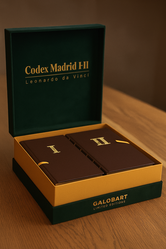
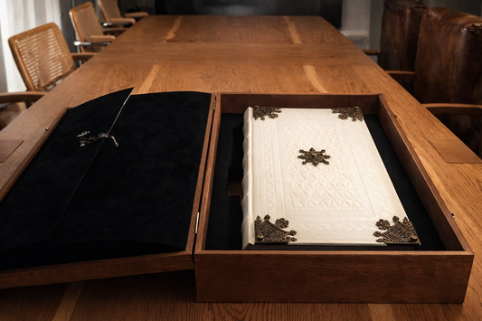
THE RESTORED FACSIMILE EDITION
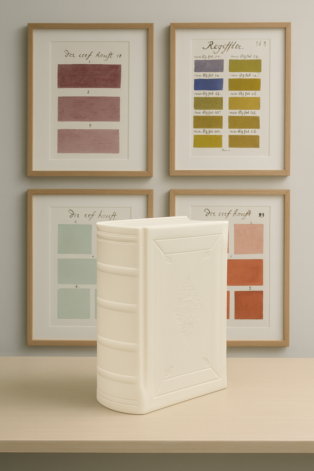
Nearly 5,000 colors shine brighter than ever, restored for the first time in history.
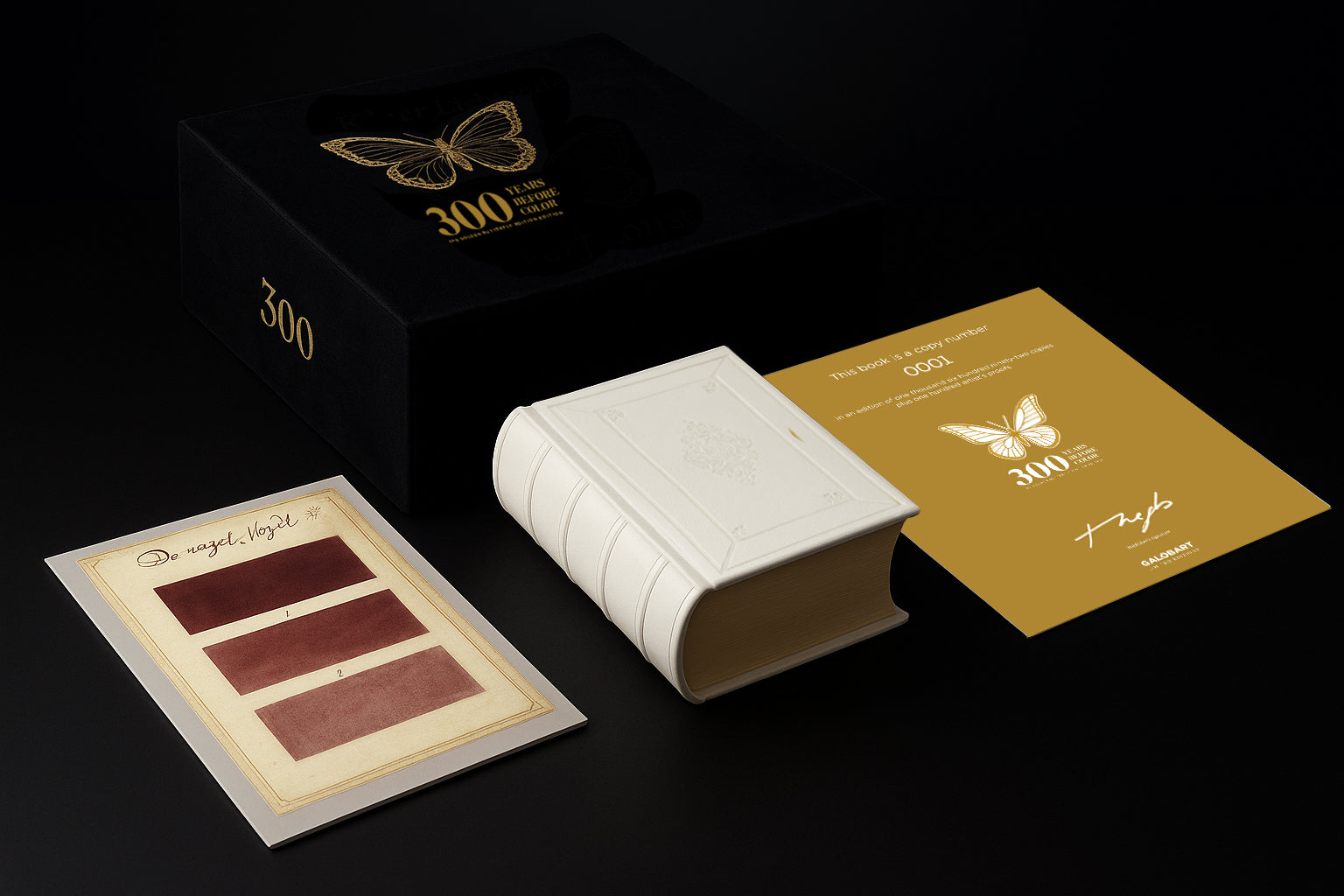
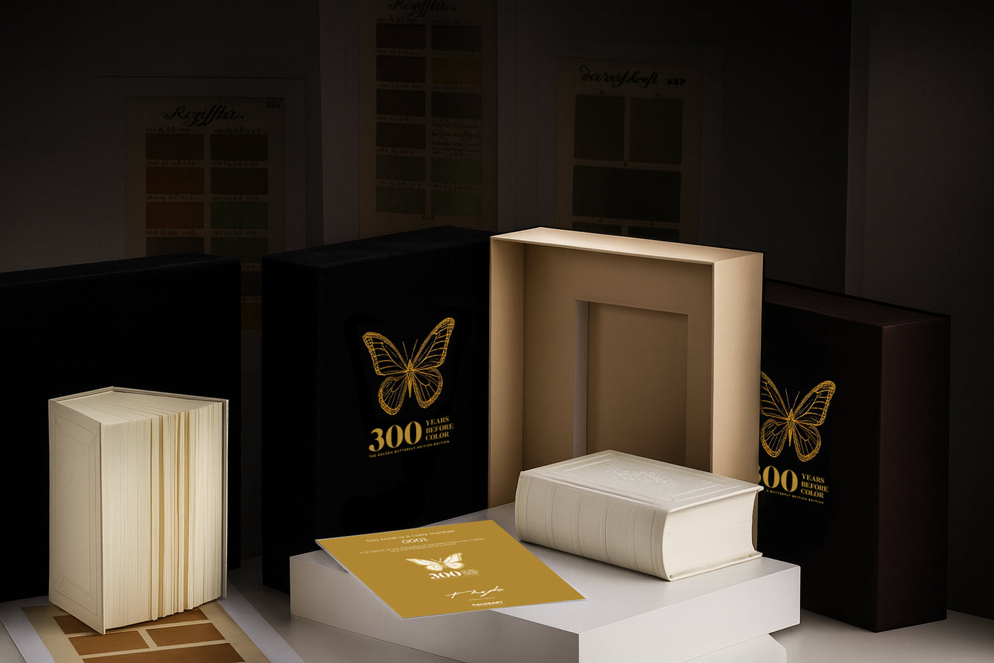
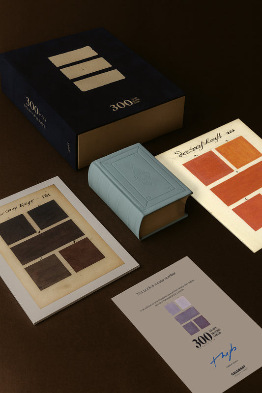
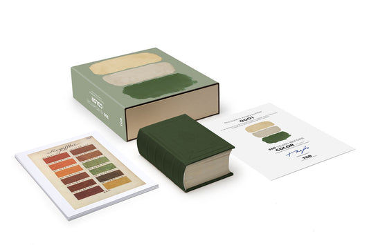
This 912-page book is a new facsimile edition of the original “Traité des couleurs servant a la peinture a l’eau” by A. Boogert; a numbered, limited, worldwide edition of 1,692 copies, in homage to the year in which Boogert wrote the book.
This new facsimile edition is hand-bound with a white Vivella hardcover that reproduces the design of the original dry-stamped cover with four ribs on the spine.
The interior is printed on Arctic Ice Paper, a luxurious paper that enhances the vivid colors of the original.
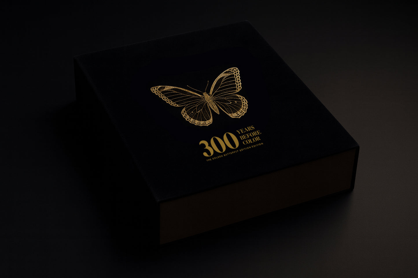
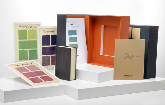
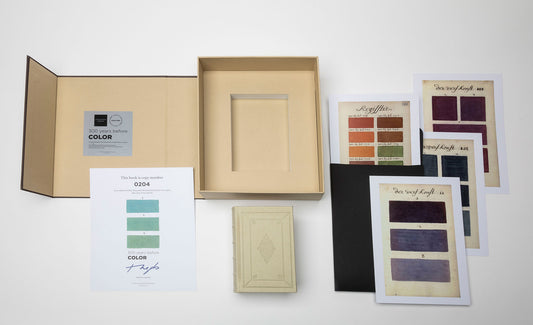
An elegant case in black velvet, with a butterfly (symbol of the first page of Boogert's work) stamped in gold. The slipcase includes, in addition to the original book, a numbered and stamped certificate of originality and ten magnificent art prints also in limited edition printed on 300 gram NEW PIONNER paper for framing or simply collecting them.
The book reproduces the original text in the author’s native language, where in the more than 900 pages of the book, the artist provides the proportions of pigment and water necessary to create each color with its tones and shades. To illustrate his explanations, he draws each page with the colors he is talking about. In addition to an index in which all the colors are listed and ordered, Boogert states in the introductory text that the book was created for educational purposes.
Over 900 pages written and painted entirely by hand, “Le Traité des couleurs servant à la peinture à l’eau” was the most complete guide to painting and color of its time.
The result was a splendid didactic guide. But the irony is that only a single copy existed, which was probably seen by very few people. If not, it would have served as an indispensable tool for more than one artist for centuries to come.
The book is accompanied by a booklet: The Color Artists with texts by prestigious art curators, writers, museum directors, artists, publishers… on some of the most important painters in history in terms of the use of color: Vermeer, Rothko, Basquiat, Sorolla ….
An ode to color, to Pantone: the essential color guide in the universe of creativity and design whose use has transcended centuries to remain a fundamental tool in the contemporary era.
⭑⭑⭑⭑⭑
Hi Alejandra,
Love , love it, love it…
Thanks for the color book, a beauty.
Jane Zuidema
Utrecht, Netherlands.
⭑⭑⭑⭑⭑
When the ad popped up in Instagram for this piece, I showed my husband right away – we both knew we had to have it.
Regina McCormick & Tyler Mann
Stafford, VA, United States of America.


 Edition sold out
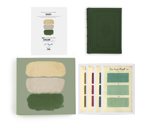
 Edition sold out
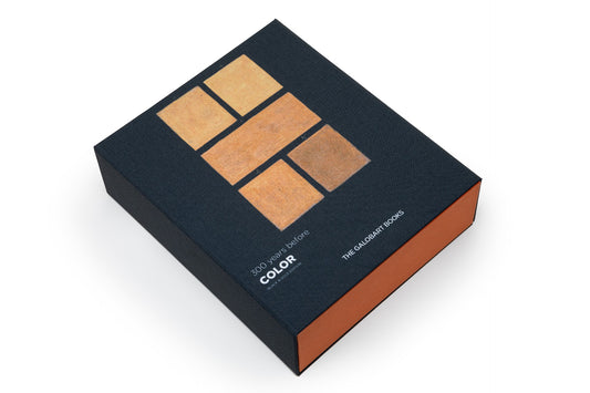
 Edition sold out
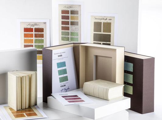
 Edition sold out
 Edition sold out